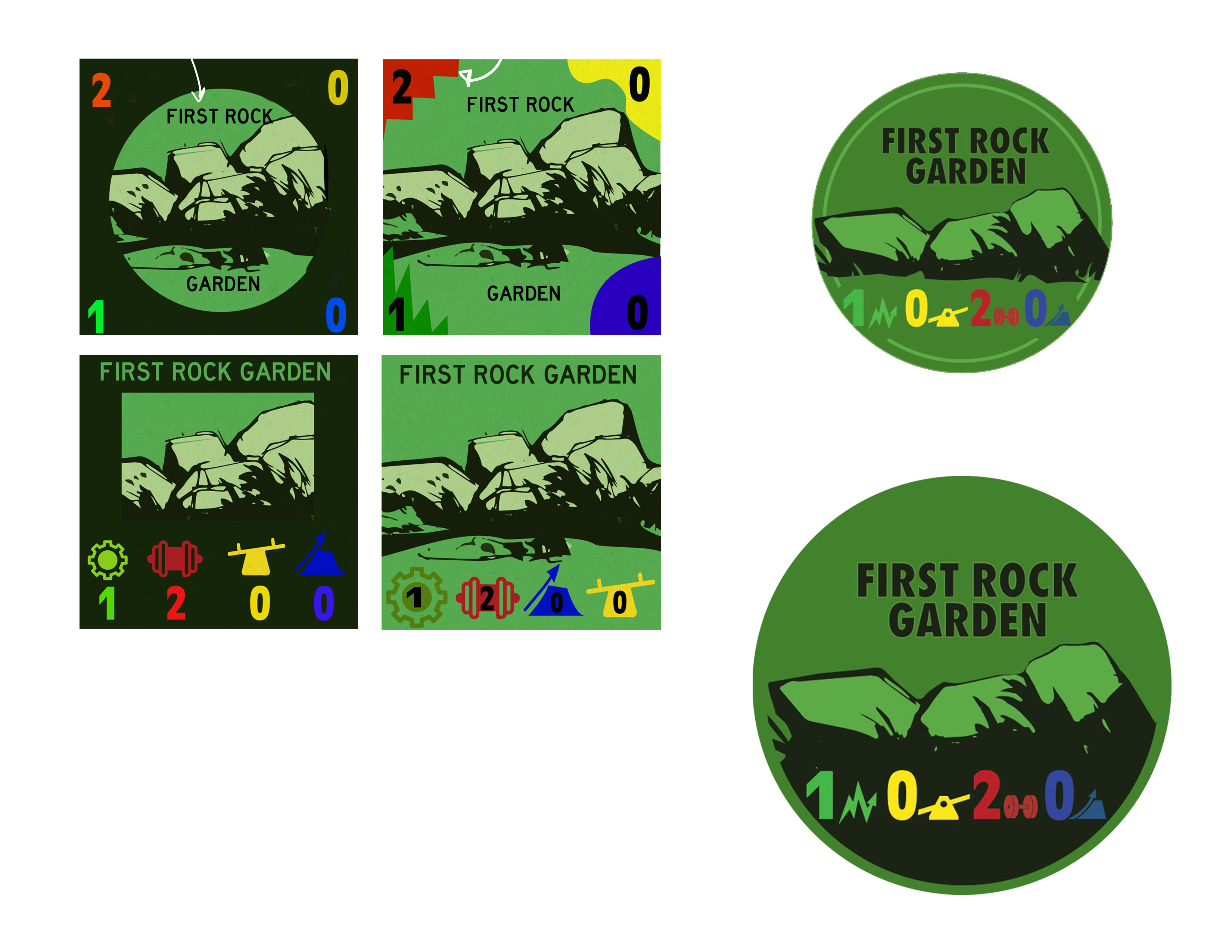
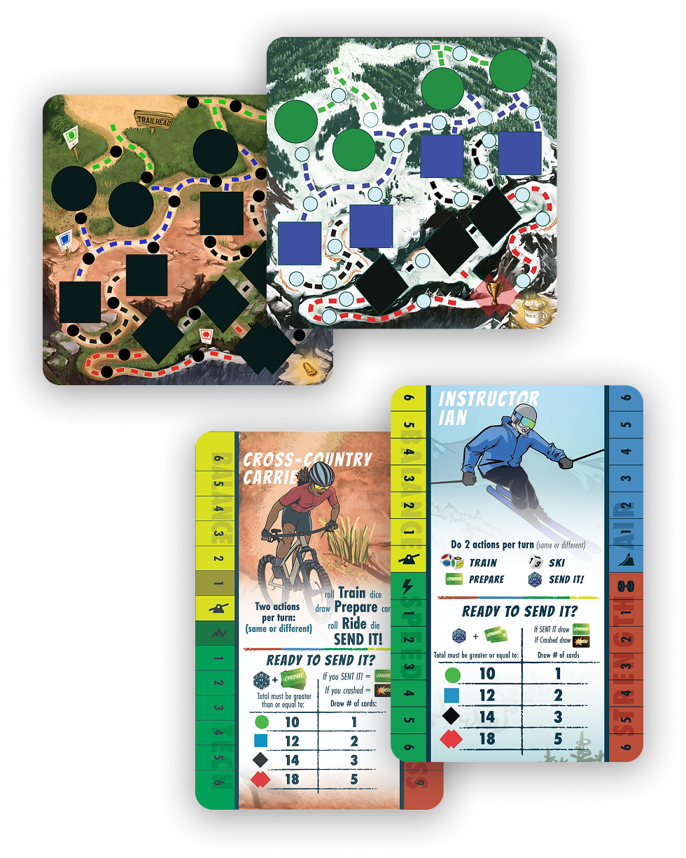
Send It Board Game

The idea for SEND IT! started with a crash. A bad crash. A crash so bad, in fact, that it led to a lot of analysis about what went wrong and a lot of board game playing. And eventually those two things came together, and the idea of a mountain biking board game was born.

Methods
Graphic Designer & Illustration
Client
Sent It Board Games, LLC.
Duration
11 months
Tools
Illustrator, Photoshop

Translating the prototype

Syd and Macky reached out to me to see if I would create the illustrations. They had already been working on a prototype and send me a version so I could play and understand the game mechanics.

Color and shape are key to quick understanding of play.

Visual heriarchy, shapes, icons and color allow a player to quickly understand the meaning.

Send it Tiles

Designed icons to reflect the skills, the color was chosen to reflect the skill and used repetitively throughout the game to develop a game play language.

Shape and color Language is Key

A.      The average player most likely recognizes a beginner trail with a green circle. Originally all tiles would be square but went eventually changed that the tile shapes would mimic trail signage shapes.

B.      Using repeating colors and including the icons would help players more easily recognize skill points.

C.      We wanted to make the card fun and thought of using large bold shapes, but in the end went for a simpler version.

Version 2.0

The Mountain Biking Game was a success, soon after the developers reached out to me to create the Ski Edition assets. The original game had been out for a while, and I received lots of feedback from players. I was eager to implement these suggestions into the ski version.

Applying feedback from the Bike game into the Snow Game.

-  Since I was not personally able to view the printer's proof, I was unable to catch problems before release. The ambitious 4-fold board caused some issues.

-  Users felt that the player cards were too cluttered, so I simplified wording and increased spacing.

-  There was feedback from players that sometimes they couldn't tell where to move their game piece, so in the second edition I defined the path more.

-  Users weren't remembering to look at the Actions section so I simplified and added a solid white background.

-  Players felt that the art was fun and enhanced their play experience.

Conclusion

Successfully funded by 546 backers pledging $50,677 with even more games sold post-launch.

The success of the first game resulted in a second version, which was a ski theme in which I could apply feedback.